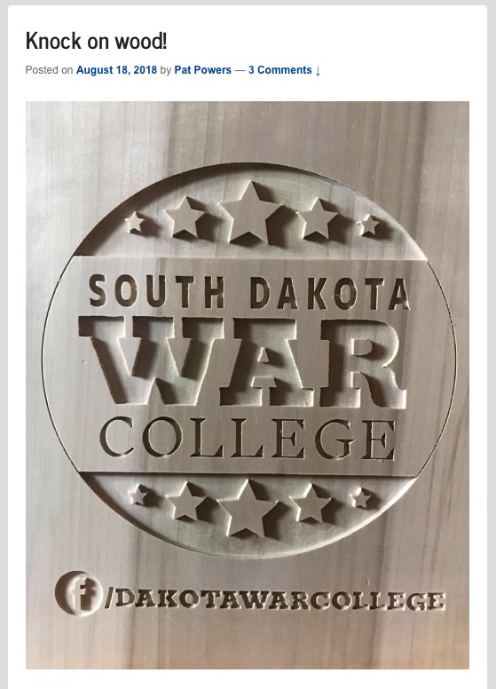
In peddling his supposed marketing cred, Pat Powers has criticized candidates for mixing multiple fonts. It thus seems odd that the SDGOP spin blogger would have his own logo etched into wood with three different fonts:
Oh, wait, I get it: Knock on wood… as in he’s knocking this wood, which violates his own professed focused-font marketing wizardry. Of course.
Anybody can print things in three fonts, but to carve that with a pocket knife in three fonts is truly a work of craftsmanship. In fact, is that four fonts I see?
Graphics in communication is largely governed by the principles of design, which caters to the aesthetic sensibility. But it is increasingly a matter of science. For example, editors found that people make more errors in reading from television and other electronic screens than from printed pages, and neuro scientists found that is because the brain picks up “static” interference from electronic screens. Graphic designers understand why a mixture of fonts can be unattractive and leave a bad impression, but a mixture can also be used to enhance and emphasize information being presented.
Those rules cited about graphics by would be experts such as Powers are indicators of poseurs who don’t know what they are talking about. Many people who claim to be political strategists merely express uninformed notions about communications and how the public responds. Good graphic designers, unlike Powers and his alleged critiques of campaign materials, have aesthetic opinions but also highly trained factual knowledge of what works and why.
My point is that Powers is a quack who peddles political snake oil, and his significance is what his quackery says about the people who invest their trust in him.
Without a doubt the worst design from Powers was the Ravansborg design with Mt. Rushmore. It is horrible. Powers is a nobody, and has absolutely no talent. He’s getting paid a fortune by the SD State GOP to peddle his garbage.
I don’t know what you see or can see, Grudzie but I see a logo with crooked and uneven sizes of letters. It is however legit folk art. A computer saw could make that piece perfect but there’s no art in computer sawing a sign. Whomever did the piece … bravo.
I got my pocket knife back and had it sharpened and have started on a whittling for Mr. H. I will use but one font, as I only know English fluently.
Grudz, I welcome your whittling. It’s your creation: use as many fonts as you wish.
Arguably, the Facebook logo “f” is a fourth font.