Last updated on 2020-06-19
We don’t get to Write Our Story here in Aberdeen anymore, but at least we get to help write our flag.
As part of the taxpayer-funded city-rebranding contract that she got once we established that letting Mayor Travis Schaunaman bid for it really would be corrupt, Councilwoman-Elect Tiffany Langer gives us these three designs from which to choose to embanner the Hub City:


Langer prefaces her designs with her thoughts and those of the North American Vexillogical Association, “the largest organization of flag enthusiasts and scholars in the world, promoting excellence in vexillology and camaraderie among those interested in flags since 1967.”
Vexillology, where have you been all my life?
Hey, far be it from me to criticize people for having hobbies.
Langer says she followed these vexillogical guidelines to produce our three choices:
- Keep It Simple. The flag should be so simple that a child can draw it from memory.
- Use Meaningful Symbolism. The flag’s images, colors, or patterns should relate to what it symbolizes.
- No Lettering or Seals. Never use writing of any kind or an organization’s seal.
- Be Distinctive or Be Related. Avoid duplicating other flags, but use similarities to show connections [Tiffany Langer, Aberdeen flag vote webpage, Aberdeen Downtown Association, retrieved 2020.06.12].
And she explains her color scheme:
Growth
The yellow star represents the sun; an integral part of growth for Aberdeen and in agriculture. Growth is also reflected within the community via Economic and Employment opportunities.Opportunity
The deep blue symbolizes the strength and prosperity of Aberdeen’s education system, community, & business sector. The continued focus on retail, trade, healthcare, and manufacturing will change the game for years to come in Aberdeen.South Dakota
The blue sky welcomes you to Aberdeen and a wealth of opportunity. Mimicking the blue of the South Dakota State Flag, the flags embrace the ideals of the state while carving out its own unique image amongst the cities and towns of South Dakota.Heritage
The white symbolizes Aberdeen’s rich history as a railroad hub, as well as a tie in with Aberdeen, Scotland, which Aberdeen was named. The “Hub City” was born of the confluence of railroads and highways and serves as a center of economic activity in the region.Open Spaces
Aberdeen is changing the game with its open agriculture and recreational spaces as represented by the green. The city serves as a center for hunting, fishing, and a wide variety of outdoor recreation [Langer, retrieved 2020.06.12].
These explanations vex us with illogic.
Evidently the light-blue echoing the South Dakota flag is only important enough to make one design.
Neither our agriculture spaces (which are brown, black, or white, not green, for nine months of the year) nor our recreation spaces represent any sort of green game-changing; they are the same game Aberdeen has been playing for decades.
Saying that white symbolizes our heritage has a Gettysburgian overtone that should make us throw all three designs back for a George Floyd-appropriate reconfiguration.
But I’ve already delayed my breakfast more minutes than I should thinking about which of these flags will be least offensive flapping below the string of other flags on our already overburdened flagpoles (below the U.S. and S.D. flag, but above the POW-MIA banner, right?) so let’s vote:
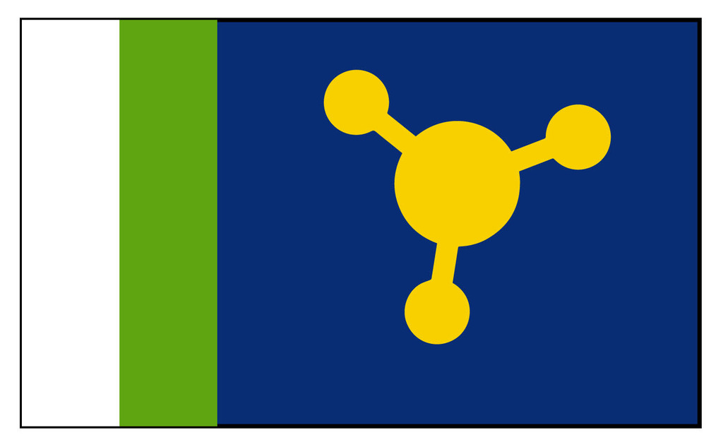
#3’s crop circles lack symmetry. If we’re going to invite Martians to land here (which I’m o.k. with), we should invite them to park in an orderly fashion.
#1 will take too much time for kids to draw. 24 little star points in the center, then another eight on the yellow, then another eight outside that? Come on.
Pick #2. Kids can draw it with eight quick swipes along a ruler and three crayons, and then they’re done and off to long division and cookies and other more important things. The second design resembles a star quilt, thus acknowledging the Dakota people from whom we stole this land and representing our true heritage of treachery and genocide. (And just so you know I’m not leaving anyone out, Aberdeen’s racists can still fill in the white diagonal bars with stars and paint “Schaunaman” and “Novstrup” over the big green fields, the same way they deface the Star-Spangled Banner with “Trump” to symbolize their ignorance, bigotry, and lack of respect for their neighbors.)
Update 08:51 CDT: Jim Ragatz notes on the Aberdeen Chamber of Commerce FB page that Aberdeen already has a flag, designed by volunteers in an Exchange Club contest, probably back in the 1980s:
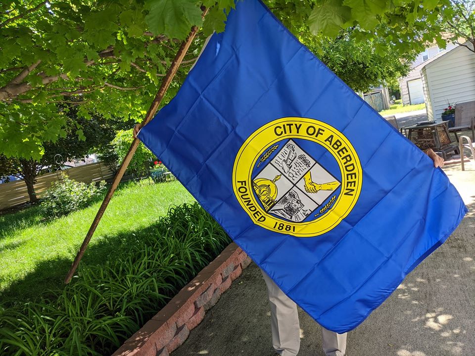
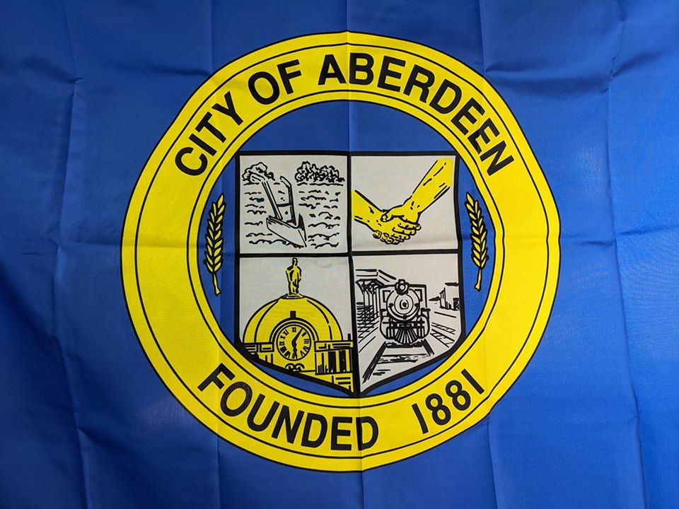
Plow, yellow people shaking hands, train, courthouse dome, “Founded 1881”, and obligatory sprigs of wheat. Not simple, but kids learn something about Aberdeen by drawing it.
And I still haven’t eaten breakfast.
A better use of those designs, in my humble opinion since my Mother of blessed memory quilted her entire life, would be for quilts to be raffled off for charity.
That third design just screams, “Meth, we’re on it.”
Middle design copies flag of Australia closely.
So Aberdeen has a flag and nobody knew that. That explains the importance of a city flag, in a nutshell. NOBODY CARES. Just another gimmick for somebody to make some money.
Cities need to worry about public infrastructure, not this kind of stuff.
Its time to DEFUND these organizations that waste our money!
Scott^!!!
I was about to say what Scott said, but he said it far better than I would have.
Bug looking for a windshield.
Jason Gnat will send someone to steal it, then what?
“Mr. DeVries has accepted responsibility for his actions and apologized to his co-workers as well as the citizens of South Dakota. This resolution further serves to assist in the preservation of our state flag for future generations.”
After the flag was noticed missing in January by Secretary of State Shantel Krebs, the state Department of Criminal Investigations checked it out and soon learned DeVries had told people he had taken the flag before he left a job in the secretary of state’s office in November 2013 after working there a year under then-Secretary of State Jason Gant.”
Other towns will seek to take the flag as part of some initiation ceremony. As an example, the hordes of Polo could descend upon Aberdeen under the guise of sheep farmers to pull the wool over the eyes of Schaunaman, pretty easily done it seems. More city taxpayer money will be exhausted to pay for the ransom and in the end, Aberdeen already has a flag. More fascist waste on a flag to wrap yourself around.
I like the middle one, though I’d switch to the lighter blue. I find the green appropriate to represent farming and growth.
I’d like to see the star outlined in a narrow, color changing band. I’m thinking of the yarn that knitters use that gradually goes through the color wheel. That would be a great indicator of all types of variety and diversity. It wouldn’t be “rainbowy,” to freak out the homophobes, but would include the Latinx in Huron and elsewhere, the Africans, Asians, and the great variety of colors that Americans include.
In addition, color around the star could indicate the Badlands, the lakes, the Black Hills, etc. Besides, it would add a little zip to the flag without cluttering it or distracting.
I love the frequent mentions of Polo.
(DON’T LOOK ANY OF THIS UP.😠)
How many of you have actually been in beautiful, downtown Polo? Do you know the name of the school? Their mascot? School song? The Roman Catholic religious order that founded the school?
Raise your hand. 🙋♀️ 🙋♂️
I have been there. Played basketball against them in the 8th grade. We won. 🏆
I like the “It’s 5 o’clock somewhere” themed panel on your 1980s flag.
Voter fraud was first noted in Hand County. Who would’ve thunk it. Presbyterians, no less, they say. “In 1882, Miller and St. Lawrence had a bitter contest for county seat, with Miller winning by a scant margin. Again in 1888, St. Lawrence petitioned for an election for county seat. Miller circulated petitions at this time, too. When the signatures were checked it was found hundreds of men had signed both. An election was set for October, 1888, but the two-thirds majority needed to move the county seat failed and it remained at Miller.” http://freepages.rootsweb.com/~handcosd/history/HC/brief-history.html
Me, I love that courthouse in Miller, very beautiful. That one and the one in Redfield are something to see.
Hi Cory!
I voted for #1. When I was a kid I loved it when I had an extra 30 minutes to draw the city flag and postpone long division. Gotta pay it forward.
Kind regards,
David
David, I would have thought you’d have been the kid using long division to figure out the angles of the 24-point star, or perhaps calculating an efficiency comparison of different drawing methods.
Mike, let’s put “Meth. We’re On It™” on the flag. Let our state slogan live forever.
Option 2 does hearken to the Union Jack in Australia’s flag and others (like Hawaii!), perhaps acknowledging the Great Britishy names of our town and others along the rail line our current flag finds worth depicting explicitly.
Call me old fashioned but I think the designs suck canal water. Communicating 1 year old jibberish.
Guessing #3 has something to do with “Hub (and spoke) City” but man, it’s fugly. #2 looks like a quilt pattern so there may be some crafting tie-ins possible. #1 is my favorite but the current flag is better.
Update: Langer and the Chamber say we’re getting Flag #1, with the centered 24-point star. Apparently there’s already an old city flag hanging in the council chambers. Langer says (AAN’s words) “There is a desire to return to the council and ask for official adoption of the new design as the city flag.” If such a return takes place next month, Langer will be a sitting council member and should recuse herself from any vote on the adoption of her commercial design as the city’s standard, as putting “designed official city flag for Aberdeen” on her resume would likely boost her own business’s marketability.
Flag number 2 looks just like the 2018 flag of Sutherland, Scotland. Why? https://en.wikipedia.org/wiki/Flag_of_Sutherland
Wow, you’re right, Mas! The geometrical match is perfect!