Thune meant shooting victims, not candidates.
It seems reasonable to suggest that a candidate for public office should never give the impression that his campaign is getting smaller.
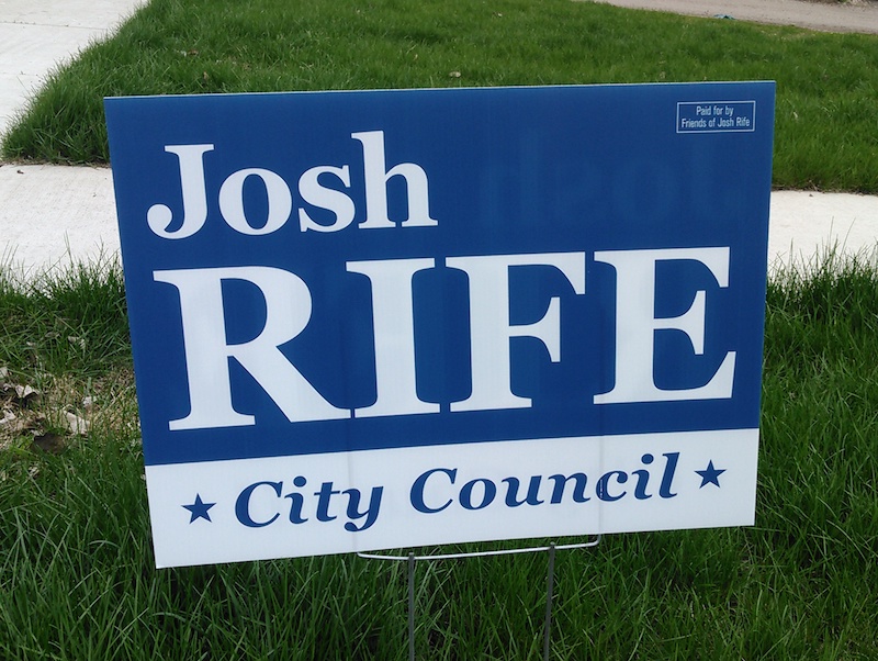
Alas, poor Josh. His original sign, shown in the top picture, was the best of the four candidate signs that started cropping up in Aberdeen’s winter-bludgeoned yards. Thanks to having the shortest name on the ballot (two four-letter words! Perfect for Aberdeen’s Anglo-Saxon political impulses!), the challenger could blow his letters up to fill that sign and make his name the most distantly visible of all the yard campaigners.
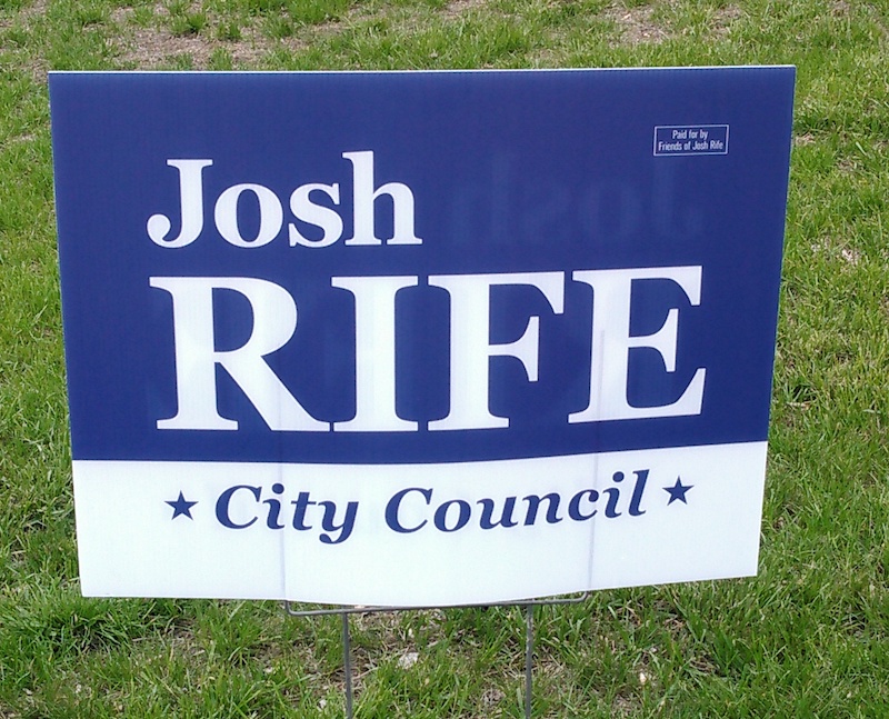
But then a second batch of signs came out last week—same design, same font, but all smaller, less readable, surrounded by empty, wasted coroplast. Aberdeen yards are now rife with signs whose quiet retreat shouts, Josh’s printer screwed up!
If yard signs matter at all (the state seems to think they do; recent research says they can swing a few votes, though I would assume that’s only in cases where one side’s signs outnumber the other’s; signs appear to be mostly demonstrative and not persuasive), then a yard sign that broadcasts a message of error and decline is a bad sign.
For comparison, here’s the sign of Rife’s opponent, incumbent local policymaker Jennifer Slaight-Hansen:
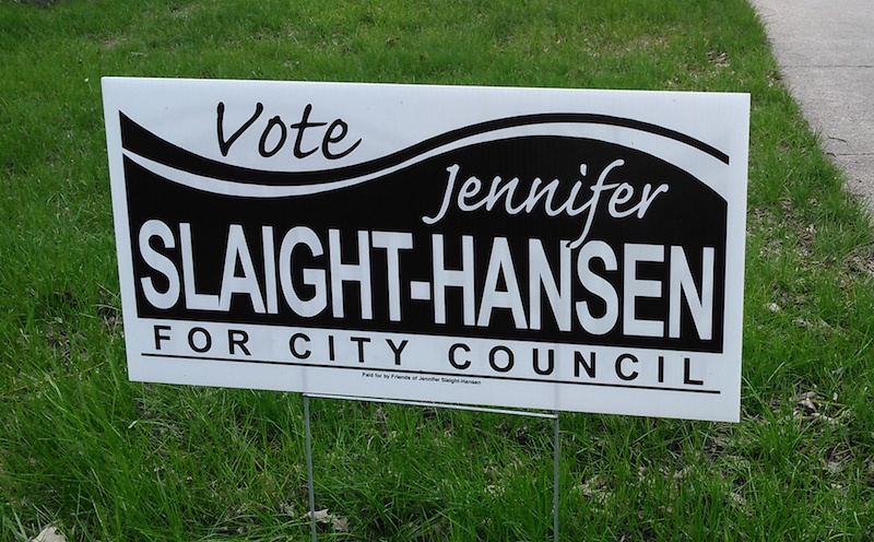
With one more letter and a hyphen more than my long last name, Slaight-Hansen faces the challenge I know all too well of squeezing all of her letters into the confines of 24 inches of coroplast. If font and signscape are equal, her name will never be as readable from as far away as shorter names. But Slaight-Hansen makes the most of her alphabetic abundance by taking the sensible design route of the non-conventional narrower sign, which helps her name dominate the graphic space and stands out from the standard shape of the other signs in the field. Narrower signs get the same job done for less money.
Meanwhile, our mayoral candidates both go for check marks:
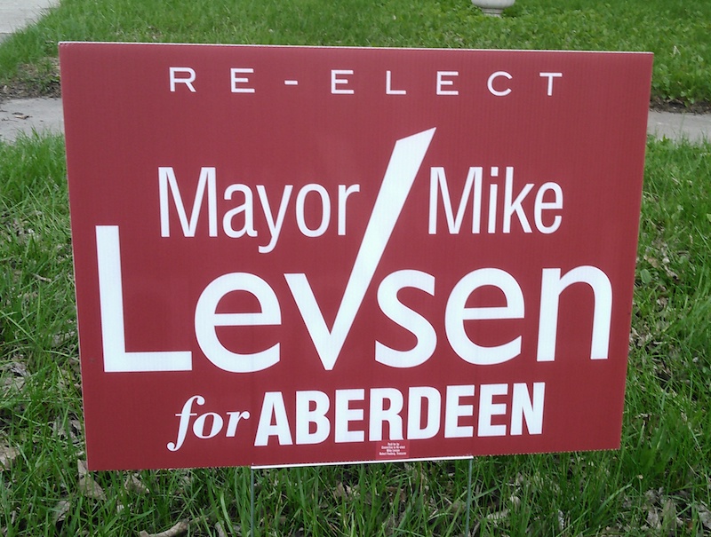
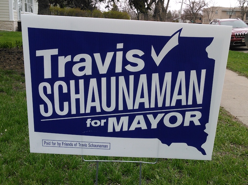
Here Levsen (6) gets the letter-legibility advantage over Schaunaman (10). Both candidates span their signs with their all-important last names, but Levsen’s font reads better from the road, since the letters have more space and run straight instead of skewed. Schaunaman’s text gets crowded more by his determination to fit everything into his South Dakota border, which I suppose is nice for when Travis repurposes this sign for his campaign against Paul TenHaken in the 2026 gubernatorial primary but which here only invites folks to wonder, “Mayor of South Dakota?” (The checkmark at least runs through Aberdeen on its way to the Chelsea-Miranda ruralplex.) Levsen’s “Mayor Mike” looks a little crowded, too, and could have stood to spread up and out to that rather bare red field above, to breathe and balance with that nice bounding “Re-elect” at the top.
For typography & branding geeks (there may be a quiz).
https://anchoredcreative.studio/blog/2019/1/22/ranking-the-2020-democratic-presidential-candidates-branding-amp-what-it-says-about-their-campaigns
Interesting, Porter. Scrolling through those logos reminds me that I could alleviate my typography angst on my own signs by going for the first-name branding the Klobuchar, Buttigieg, and others use. I don’t like first-name campaigning, but the graphics would be easier:
Just sketching here….
I like that. Baby blue is a trustworthy color, also. I’d think most of the good people of District 3 know who CORY is.
PS … Happy Anniversary, tomorrow
That was interesting. Thanks for the link Porter.
You’re welcome, Deb. The most visually appealing to me is TULSI GABBARD. What say you?
~ Let’s have a little straw poll over the next week and see what all the DFP readers think. Which of the Democratic candidate’s campaign logo images do you like best. Tell us why, if there’s a reason beyond that you just like it.
https://anchoredcreative.studio/blog/2019/1/22/ranking-the-2020-democratic-presidential-candidates-branding-amp-what-it-says-about-their-campaigns
Hickenlooper, Harris, Inslee. Tulsi’s is near the top, but I’m not as fond of the gradient, even though it’s very Hawaiian.
I like Kamala’s colors, Hick’s mountains and Inslee’s globe. Guess they appeal to my artistic instincts. I like the simplicity of H and I, and K’s slogan.
Can’t decide yet among those 3. I need to ponder for awhile.
Thanks, Porter! For name recognition, I can’t go wrong with either first or last name. Cory Booker is the only other Cory who jumps to mind as taking up media space, and there are definitely no Heidelbergers competing for attention.