I am pleasantly surprised to find the Legislative hopper freshly stocked on a weekend. I am unpleasantly surprised to find the Legislative Research Council has adopted a new and less accessible method of posting bills for public reading.
In past Sessions, LRC posted bills in two formats: HTML and PDF. The PDF version preserved the original printed format, showing page and line numbers. Those numbers are useful for following debate and amendments, which generally identify pages and lines rather than bill sections. However, PDFs are a pain for viewers using smaller screens; fitting an entire PDF page on a phone screen means the text will be illegibly small, so readers have to scroll right-left-right-left as well as down to read the full text. The HTML version was far better for smaller screens, as the plain text would size itself to the width of the screen:
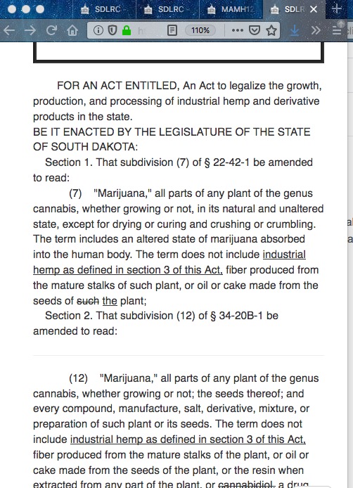
Users could increase the font size on those bills and still see the text fit itself to the width of their screens. Larger fonts mean more vertical scrolling, but that’s the price we pay for our eyes getting older:

The new HTML version of 2020 bills takes away that resizing functionality and copies all the inaccessibility of PDF. Here’s what happens when I try to look at 2020 SB 2 in HTML view on a narrow browser window and what you’ll see when you try to read it on your phone:
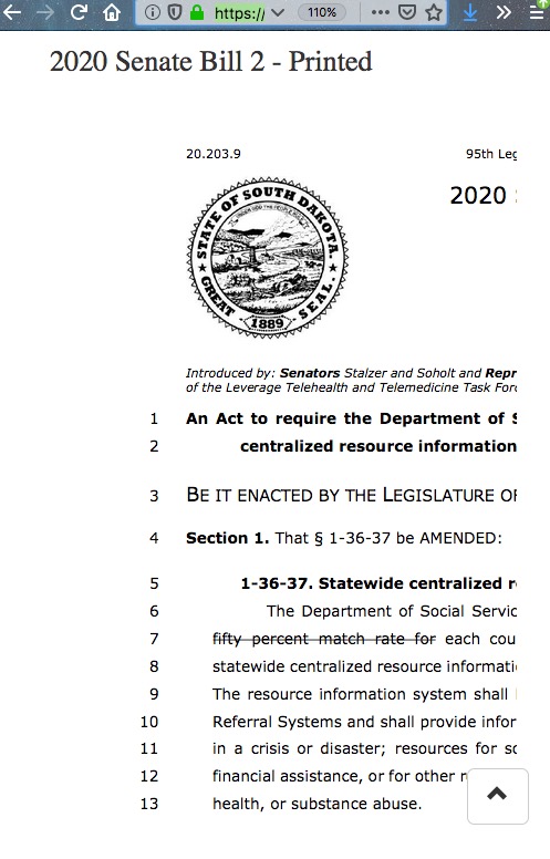
Now no matter which view you use, PDF or HTML, if you’re reading on your phone or another narrow screen, you can’t put the entire text of the bill or even a full section in view on your screen. The text overflows off the right edge of your browser window, and you have to scroll right and left, right and left, to read each line in full. Even on my laptop, which has a reasonable 13-inch screen, I often have two browser windows side by side: a larger window on the left for the bills and articles I’m analyzing and a smaller window on the right for the blog post I’m writing. LRC’s new HTML format wrecks that arrangement, too, as its left sidebar hogs space and leaves the bill text cut off, preventing me from seeing and transcribing complete sentences at a glance and requiring me to constantly interrupt my typing to switch back to the bill window, scroll a little right to get the rest of a line, type a bit, then scroll left to get the beginning of the new line, and so on:
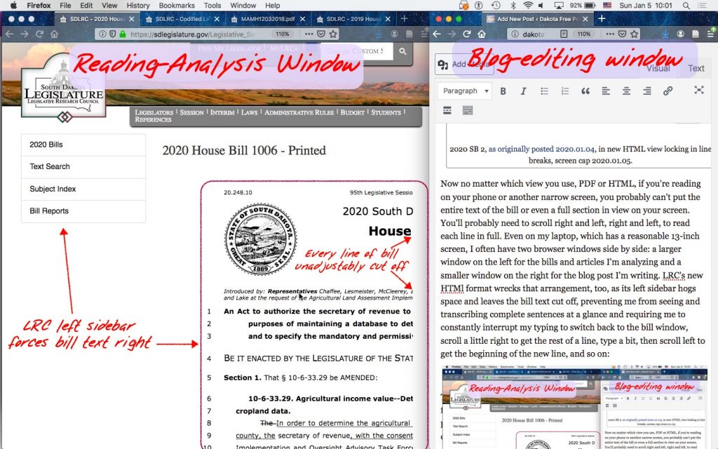
This is no trivial malfunction. When legislators, lobbyists, reporters, and other interested citizens can’t see every word of a sentence or a section together on one screen, they are more likely to misread the text. The new format more frequently interrupts our reading comprehension with the need to hit a button or swipe the screen to see what comes next.
We can’t fit every bill on a single screen or a single sheet of paper, but now people reading bills on phones and smaller tablets can’t even get a complete sentence on a single screen.
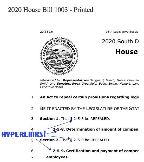
The new LRC HTML format for bills does offer one improvement: they’ve added hyperlinks! That functionality is nice on bills like 2020 HB 1003, the text of which calls for repealing two statutes. Usually bills repealing statutes write out the existing statutes and strike them out on the page like this. Now 2020 HB 1003 can simply say, “Section 1. That § 2-5-8 be REPEALED,” give the title of the statute, and leave it to readers to click the hyperlinks to read the targeted statute:
These hyperlinks are available on the PDF bill versions as well.
But even this welcome hyperlinking poses two problems. First, LRC fails to identify the hyperlinks. The links aren’t bold, blue, underlined, or otherwise obviously cued. It was only by chance mousing about that I noticed my cursor switched from arrow to pointy finger over the statutory citations, indicating clickable links. Such cursor cues don’t exist on touch screens, so who knows how long it will take a phone or tablet user to realize the statutes targeted for repeal are available with a tap of this page?
Second, the hyperlinks now invite more confusion by removing the statutes to be repealed from a single view on this bill page. Previously, if a bill simply repealed existing laws, I could see each stricken statute in full on that single screen. Now getting the full picture requires looking at separate screens, which invites misunderstanding.
Being a legislator or a legislative reporter is hard work. Unfortunately, LRC’s revision of its online bill format only makes that work harder. LRC should use and cue its hyperlinks more helpfully. More importantly, LRC should immediately drop its new HTML format and revert to the more accessible plain-text format it used in previous Sessions.
The LRC is all powerful and wise, and knows what you need, Mr. H. Those councils are the masters who actually steer all the puppets during the sessions.
Mr. H, I had several telephone calls about this. They say if you turn your phone sideways and then pinch on the screen you can see it all fine, or use a different blue like to the bills. They said there are better blue links which ignore all the listings the Council puts along the left side of your screen. They said these blue links are smaller.
Grudz, I can’t make sense of your comment about links. On what browser and device do the links show any visual cue?
Rotating the screen sideways may help some viewers, but the lines remain locked in length, PDF-style, and viewers still don’t have the more accessible plain-text option. Pinching the screen ignores the problem of text being too small for many viewers to read. This revision seriously degrades the usability of the site.
Cory, sometimes I think you have lost your mind.
Unless YOU are grudznick (which I consider from time to time), it makes absolutely no sense for you to take seriously the gibberish grudznick just published.