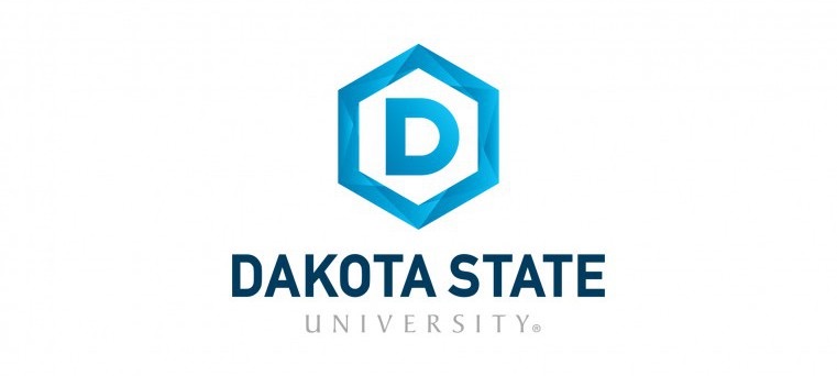
After a year of work, Dakota State University has come up with a new logo:

The university’s new logo is a single “D” surrounded by a hexagon. It combines modern elements with a hint of tradition. The hexagon itself is a building block representing community and unity. Other graphic elements within the hexagon design illustrate Dakota State’s commitment to forward thinking and its unique approach to education [DSU marketing-speak, 2019.05.03].
I assume that the little circled R at the end of the logo means we alumni will have to pay royalties when we publish our résumés.
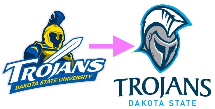
That year’s-plus labor did also produce a new school color scheme—no more yellow, just blues and gray—and a new mascotted logo:

In this regard, the marketing-speak is accurate: the new color scheme puts more daylight between DSU’s logo and the blue and gold of SDSU just forty miles away.
Local Tangent: It only took four months from the time TruShrimp bailed from Minnesota to Madison for a bigger corporate welfare check for the city to consider moving a water tower from the northwest part of town to TruShrimp’s future backyard on the opposite corner of town. Chuck Clement reports TruShrimp will use 300,000 gallons of water a day, “equal the water used by about 3,000 residential homes each day.”
I actually like the new logo and colors. It’s more appealing than a simple rectangle with the letters “DSU” and “Dakota State” inside it. Perhaps the reason why it took over a year is that the design teams were also considering different logo designs besides the eventual hexagon choice. Since those meetings happen behind closed doors, it’s unlikely we’ll ever see those other designs that were up for consideration, if there were any at all.
These blue hexagons have also been appearing on campus over the past few weeks, being installed on large windows of various campus buildings like the Karl. E. Mundt library and the Beacom building.
The hexagon does make for an awesome little icon on a phone app.
Honestly, it reminds me of a techno version of the Democratic Party’s logo (a blue circle with a “D” inside it).
Where are the “other graphic elements within the hexagon design”? Is that how they say “D” with 7 words?
Speaking of branding, SDPBTV or radio or whatever tounguetwister they call it, now likes to say, over and over: broadcasting “from and for the greater Black Hills area” :) wtf? For what? Greater than what, the Bad Lands, Railroad Buttes, Caputa, Vale? Geez. (Sorry for the uneditable typos)
these local SD media administrators are so lame….
An eager reader suggests that DSU Marketing may be expressing their antique auto fandom with their nod toward the old Durant:
There’s nothing new under the sun in advertising….